Colors do more than decorate a space—they influence how a person feels, interacts, and experiences their environment. In modern residential communities, the application of color psychology has become an essential part of design strategy, especially in apartments and common areas. With lifestyle-focused developments like Birla Evara in Kodathi Village, the thoughtful use of color enhances both aesthetics and emotional well-being.
As apartment living continues to evolve in high-demand locations like Sarjapur Road and across Bangalore, the impact of design elements like color is becoming more intentional. From energizing shades in fitness rooms to calming tones in lounges, each color tells a story and serves a purpose.
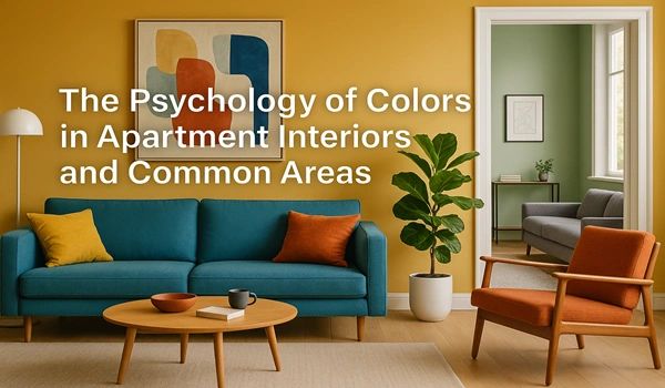
Warm Colors for Energy and Social Connection
Warm tones—such as reds, oranges, and yellows—tend to evoke feelings of warmth, excitement, and energy. These colors are often used in:
- Children’s play areas: Bright hues help create an energetic and joyful atmosphere.
- Recreation zones: Spaces like game rooms benefit from vibrant shades that stimulate engagement.
- Common lobbies or social lounges: Touches of warm tones encourage interaction and a welcoming feeling.
However, these colors are often used in moderation to avoid overstimulation and to maintain balance within shared environments.
Cool Colors for Calm and Focus
Cool colors like blue, green, and lavender are widely used in residential interiors to support relaxation and peace. Their impact includes:
- Bedrooms and meditation corners: Blue promotes calm and can aid in restful sleep.
- Reading rooms and libraries: Greens and muted blues support concentration and reduce stress.
- Fitness or yoga zones: Soft earthy greens help maintain a grounded, centered mindset during workouts.
In well-planned communities like those on Sarjapur Road, such subtle applications of color contribute to a more holistic living experience.
Neutral Tones for Flexibility and Sophistication
Neutrals like beige, cream, taupe, and greys are often used as base colors across homes and corridors due to their versatility. Benefits include:
- Timeless design appeal
- Ease of matching with furniture and décor
- Ability to increase natural light and space perception
These tones are great for living rooms, dining areas, and shared passages, where understated elegance is preferred.
Color Zoning in Common Areas
In large residential developments, color zoning is increasingly used to give identity to various shared spaces. For instance:
- Pastels in daycare areas promote a nurturing ambiance.
- Bold colors in co-working spaces enhance productivity and creativity.
- Soft tones in garden seating or amphitheaters support comfort and relaxation.
Using color to subtly define functions within the property also improves wayfinding and spatial memory for residents.
Bangalore’s Evolving Palette of Urban Homes
In vibrant urban settings like Bangalore, where daily life is fast-paced and often high-pressure, the role of interior environments becomes essential. Projects like Birla Evara are incorporating color psychology not just for beauty, but to foster harmony across residential and community spaces. Located in Kodathi Village, the project balances urban living with a calm and emotionally uplifting design approach.
Key Takeaways: The Value of Thoughtful Color Use
- Colors can influence daily moods and long-term emotional well-being.
- Every room benefits from a tailored palette based on purpose and energy level.
- Shared spaces become more welcoming and functional through strategic color application.
- In modern housing projects, color plays an active role in supporting a resident’s lifestyle.
As design trends move toward mindfulness and wellness, the psychology of color remains a valuable tool for shaping environments that not only look good but feel right.